

Buckle up Photoshop CC users, this is going to be a bumpy ride.
This February, I had the blessing/curse of needing to update my laptop. After a 6+ year run, my 17" MacBook Pro finally kicked the bucket, taking my well-outdated copy of Photoshop CS5 with it. Ignoring the obvious costs associated with upgrading, this also meant a minor (or so I thought!) switchover to the most recent, subscription-based Adobe Photoshop CC software.
Now everything was all well and good. I got my machine re-configured to my liking from a stable backup and things were humming along. Except for that, within the first week or so, I noticed that something was off with my photos taken while I was out on assignment. Nah, that's way too nicely said — They looked like shit.
Okay, so it wasn't the photos that were terrible, per se, but the toning. I'd edit my RAW images the same way I'd always done. But they'd come out looking... well...nasty, grungy, and just not my style.
Now, a running joke/point of contention in the photojournalism world I inhabit is the issue of over-toning, over-editing, and all-around over-post-processing of images (especially those entered into the pantheon of photojournalism yearly contests: See the multitude of stories on World Press Photo). It's even enough of a meme that a colleague of mine posted this clever GIF a few years back that exemplifies a primary culprit in the over-processed photo world: CLARITY.
All I see when I view many journalist's photos
Posted by Kristen Tomkowid on Saturday, February 25, 2017
So, after seeing that disappointing image toning on a couple assignments, I started to do some digging into what was actually going on. And it looks like Adobe has pulled a fast one on us all.
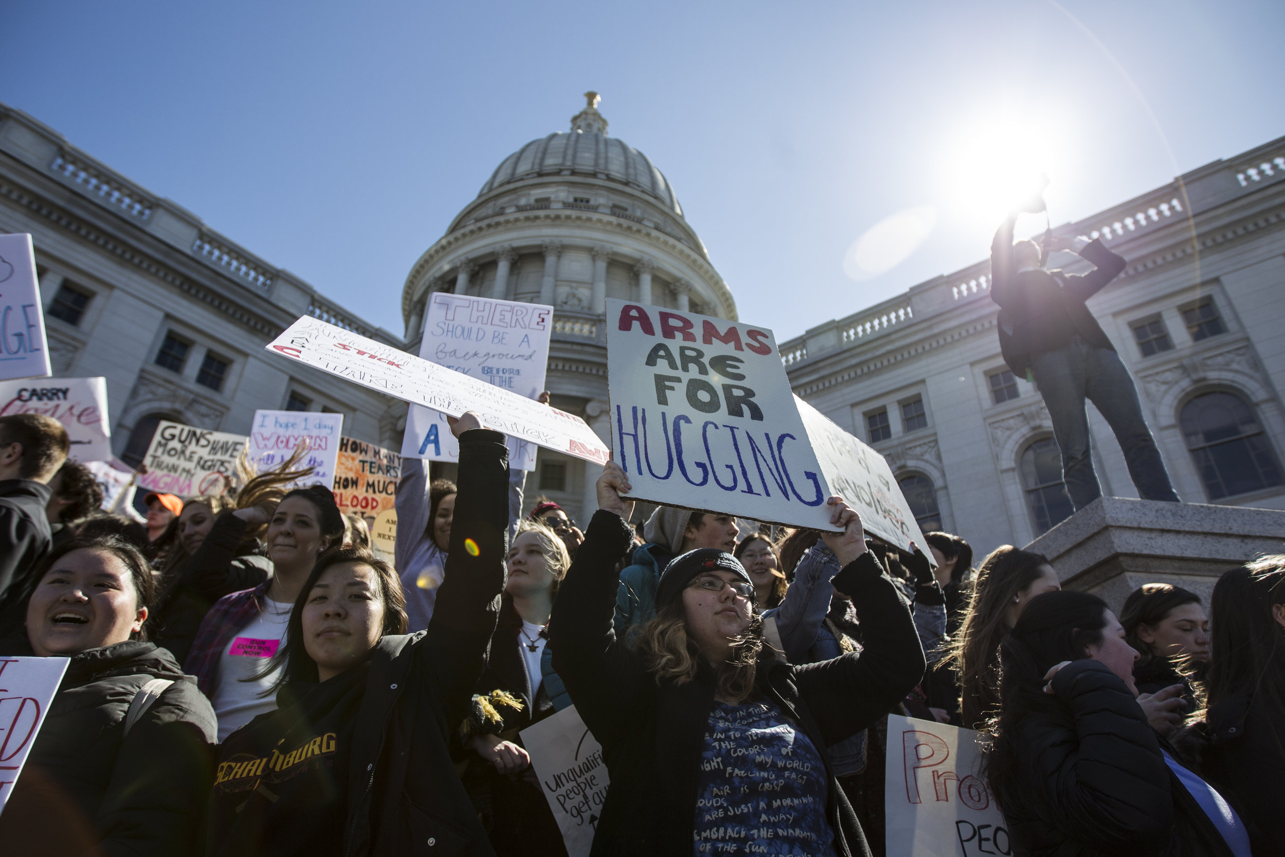
Take a look at these photos I shot on assignment for the Cap Times here in Madison last week during the National Student Walkout. The image on the left of the slider is processed using the 2010 Version of Adobe Camera Raw processing and the image on the right is the Most Current Version of ACR — with both images given a +40 bump to the Clarity Slider.
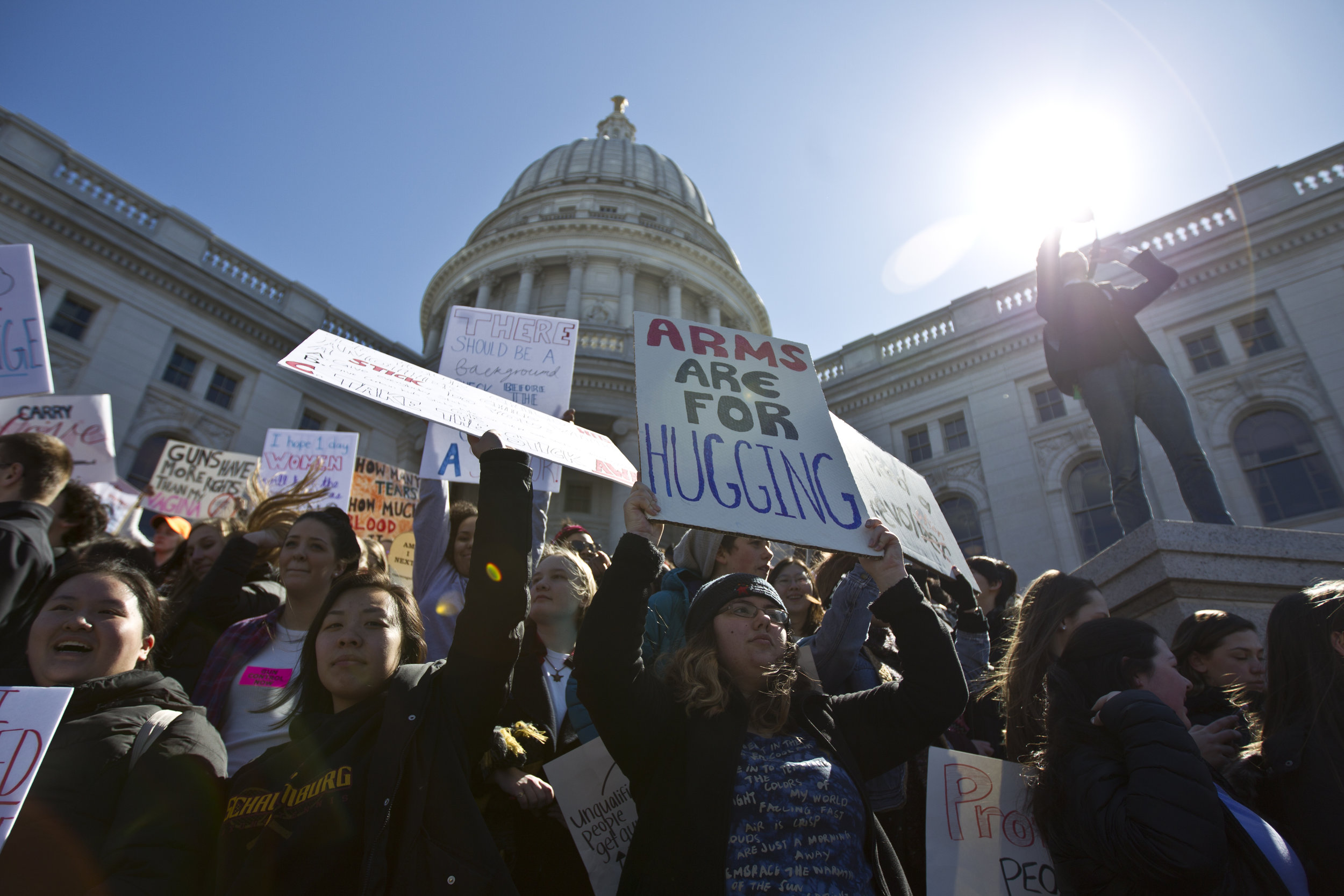
And here what that image looks like with NO adjustment to the Clarity slider
Click to display full size
Will ya look at that? Now, before everyone starts saying "There's no way you processed those the same! You must have missed something!" ... both of these images were completely Straight Out Of Camera with no adjustments made to any setting aside from bumping the Clarity slider (a tad higher than I'd ever go naturally, but done to prove a point).
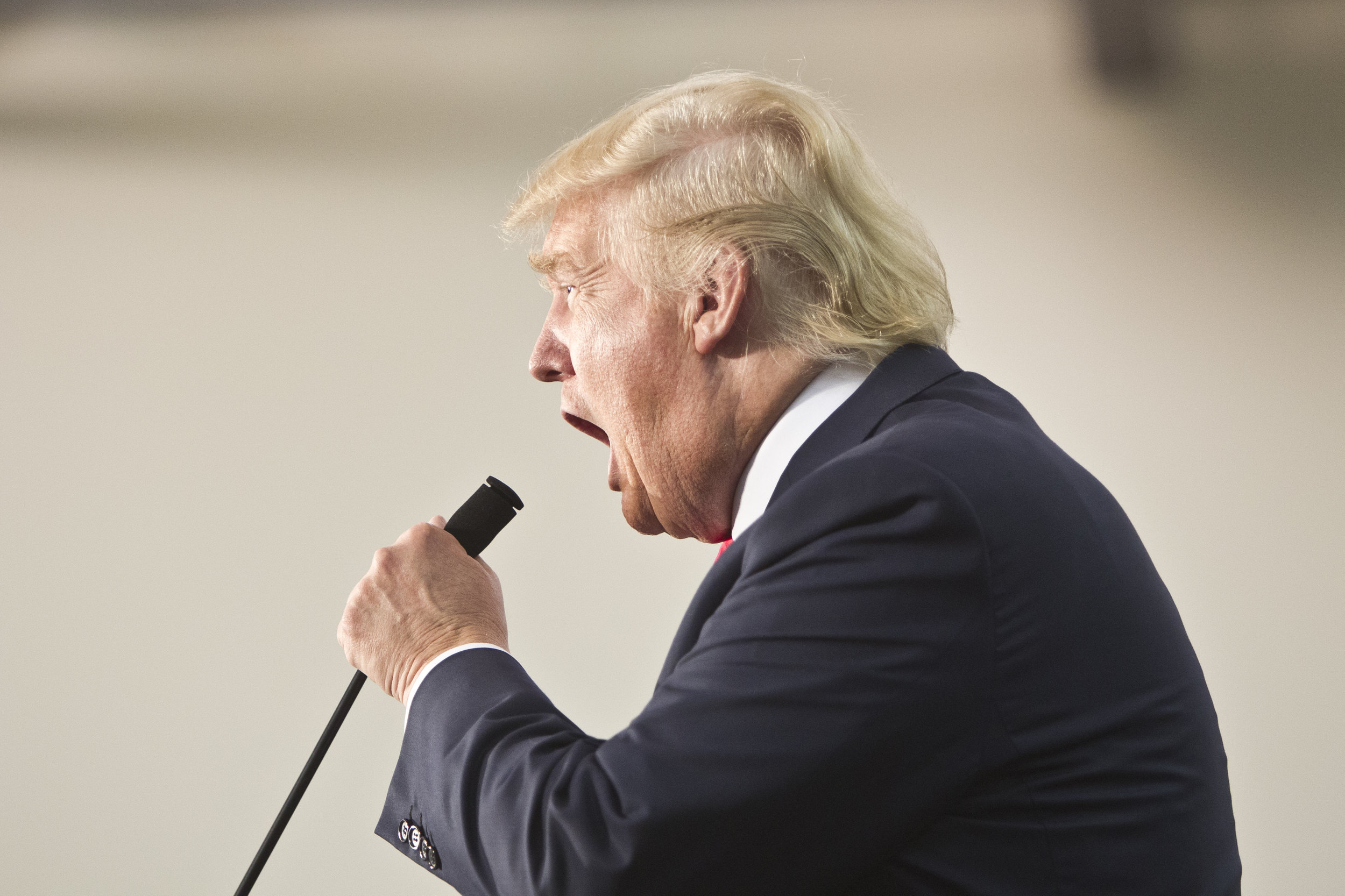
And here's another example from a past assignment "way back" in 2015 when I photographed then-candidate for President Donald Trump in Dubuque, Iowa.
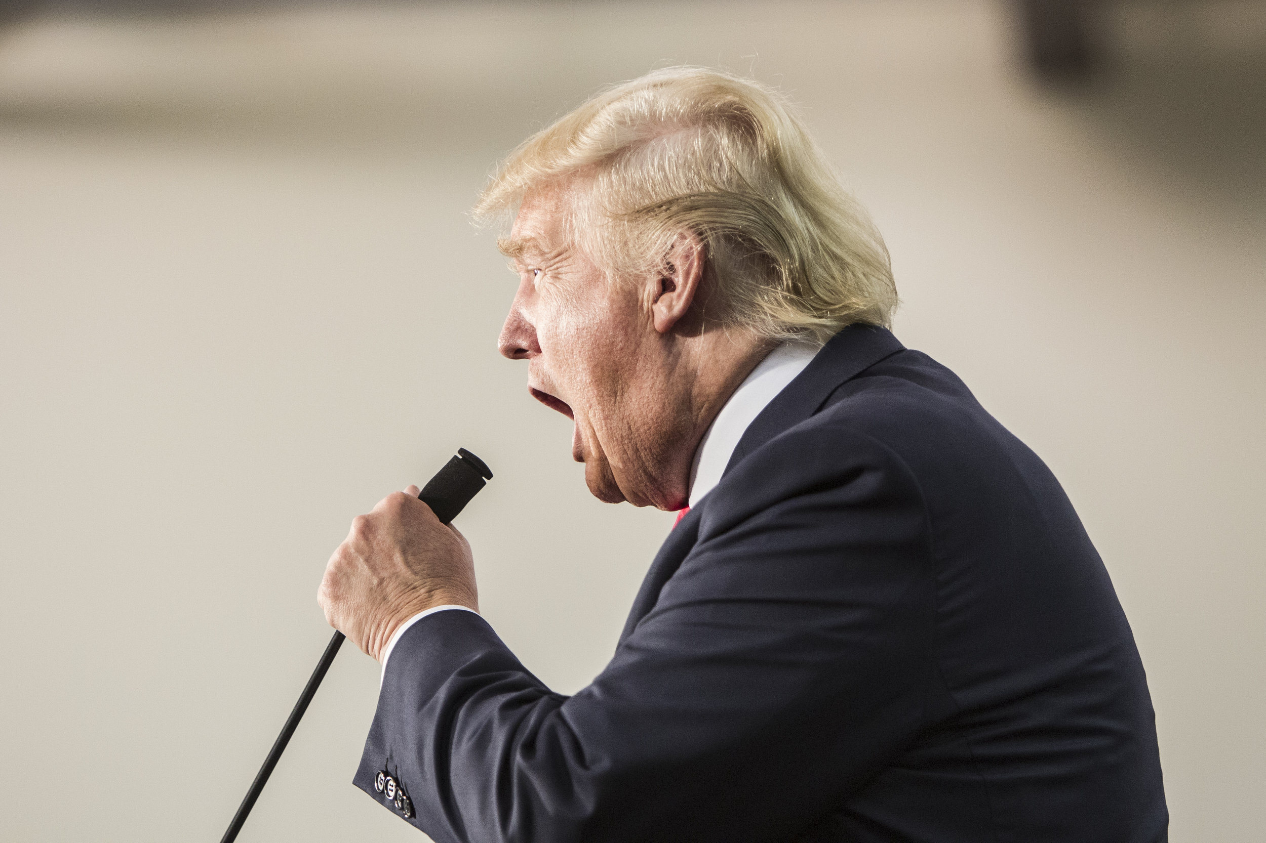
And again, here is that SAME image with no adjustment to the Clarity slider:
Pretty brutal, huh? I know that it's been the "trendy" thing in the photography industry over the past few years since Instagram introduced the "Lux" adjustment in their app that accomplishes the same feat as "Clarity".
But I'll put it out there, it's making reality look, well, WRONG.
Sure, it can be used for stylistic reasons here and there. But in making this over-micro-contrast processing of images in Photoshop the "norm" (without any documentation in updates or announcements that I'm aware of) Adobe has quietly been complicit in the photography industry's addiction to this look.
Now look... I really have no expectation that Adobe or anyone involved in Photoshop CC development will see or respond to this. Is it shitty that they dramatically changed the sensitivity of the Clarity function between app releases? Yeah. Is it frustrating that they've never made mention of how or why they made us all get used to the over-processed, grungy look? You bet. Does it do a disservice to those of us tasked with representing visual objectivity for our career? You're damn right it does.
So photographers and anyone who's editing photos on Instagram or fond of Camera Raw: Be mindful of how you're processing your images. Don't let an algorithm or a coding adjustment make your creative choices for you. And last but not least, get a little CLARITY on why the photos we consume look the way they do.
Cheers, everyone.